Select and apply color
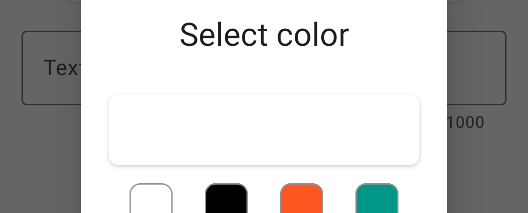
You may have noticed that when the color picker for the back color is opened, the default back color (black) is not shown as the current color. Instead white is displayed:
s2
To have the correct color set, we will use a method that will be called when the color picker is opened. Add the following to the ColorPickerDialog class:
Instead of calling the setSelectedColor method directly, let's call if from another method named updateUI. Later on, we will add a few more method calls to the body of updateUI :
... then include the call to updateUI in the constructor of ColorPickerDialog :
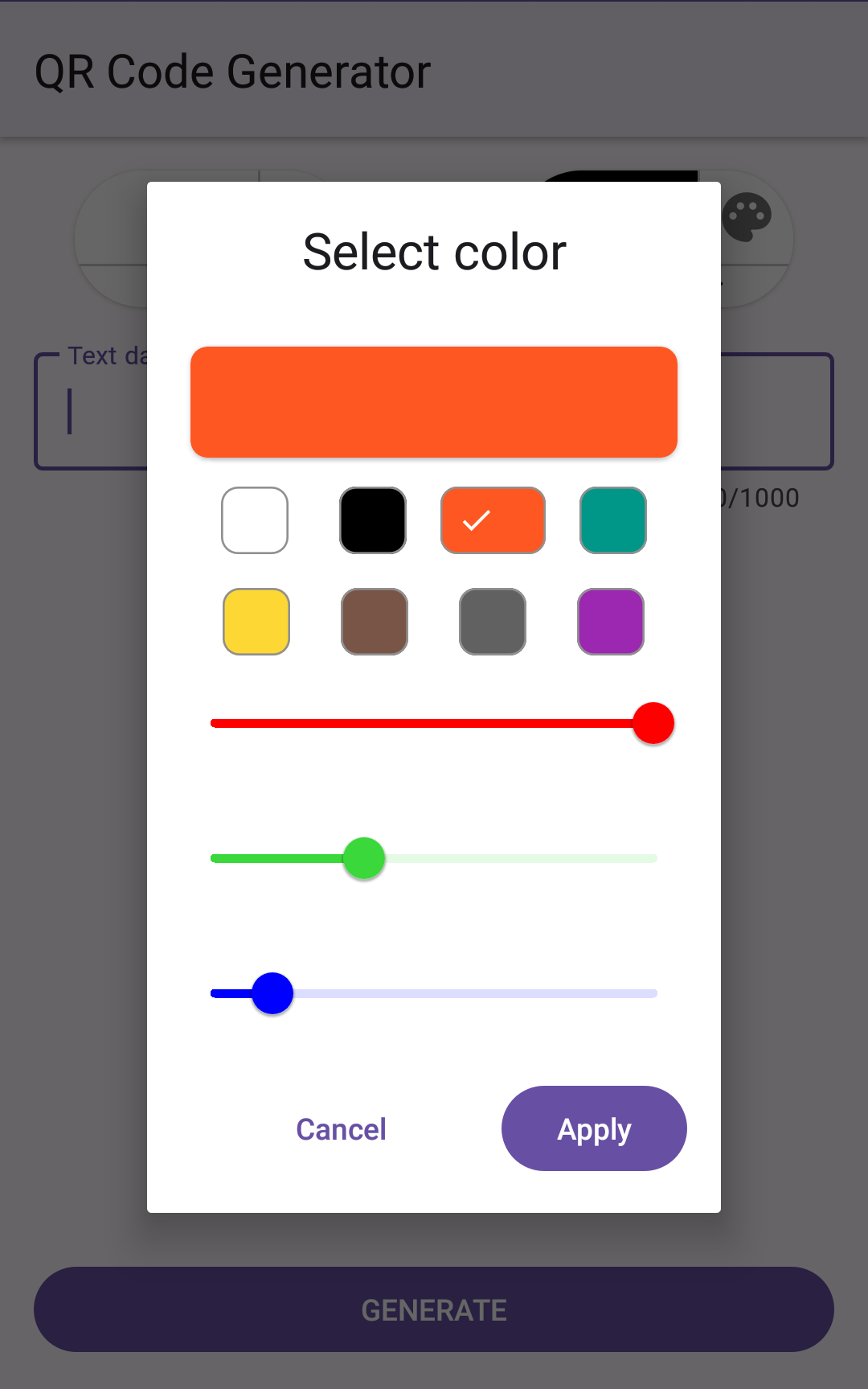
The color preview box will now show the color that is passed into the constructor. However, that same color must also be indicated by the values of the sliders. If that color matches one of the preset colors, the button for that color must have a check mark icon to show that the color is selected. Let's add 2 method calls to updateUI like so:
setSliderValues will make sure the sliders have values that match the RGB values of the selected color. applyPreset along with a few other things, will apply the icon of matched preset color. More about these two methods will be explained below when their code is provided.
The call to applyPreset uses the return value from the static method colorToHex from the class Util. We do not yet have that class, let's create it by adding a new file named Util.java to the project and add to it the code below. The colorToHex method accepts integer value that represents a color from the RGB colorspace and returns a string with the hex color code.
The next thing we will do is to make the buttons/chips for the preset color apply the apppriate color when pressed. The method that will do the work is applyPreset and it is shown below. The first thing to be done when a preset color button is pressed is to clear the check mark icon used by each of the buttons to indicate the currently selected color. This which will be done by the clearPresetSelection method:
After clearing the icon on all chips/buttons, the applyPreset method tries to get the hex color string value from an object that is passed in as an parameter to the method. The hex color value is used as a key to get an element from the presetMap, which contains the objects representing the preset colors. If a non-null PresetData instance is found in the map, then the appropriate color information is applied. First, we apply the appropriate check mark (light or dark), for the color to the button. Next, we update the selectedColor variable with the newly selected color value. The color preview is updated in the UI by calling the setSelectedColor method that we defined earlier. Finally, when a preset color is selected, we will also update the sliders to have values matching the new selection - this is done by the setSliderValues method:
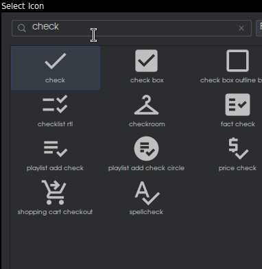
In the applyPreset method, there are two references to drawable resources: one for a white check mark icon, and the other for a black one. Our project does not yet have these drawables. Let's add them like other vector drawables and in fact, we will add the same vector asset twice but will different names. One will be named check_black and the other will be named check_white. The vector image we are adding will look like the one shown below. You can find it by typing 'check' in the search box:
s15b
Open the drawables/check_white.xml file and make sure that both the attribute named android:fillColor and android:tint are set to #fff (white).
Open the drawables/check_black.xml file and make sure that both the attribute named android:fillColor and android:tint are set to #000 (black).
If you were to run the app at this point, nothing will happen because we have not yet set the listeners for when the preset chips/buttons are pressed. We do that by updating the setListeners method to be like this:
You will notice that in addition to setting listeners for the preset color chips/buttons, we have also set listeners for each of the sliders. When a slider has its value changed, the slider's change listener will clear the check marks of all preset color buttons, if any were set (clearPresetSelection). Next, the value of the slider is used a the value of the appropriate RGB component of the color being changed and that value is used to create a new value for the selectedColor variable. Lastly, setSelectedColor is called so that the preview shows the new color.
If you run the app now, you will be able to choose and apply any color that is within the RGB colorspace.
s19
If you have any issues, you can compare your code with the source code up to this point from github