Completing color buttons
Now that we have a layout to use for the color buttons, we will apply it. Open your activity_main.xml file for editing and go to the fore_color_button button. Replace the entire button with the following <include>:
You can read more about <include> here . You can see that the layout attribute references the layout_color_button layout we already designed. The rest of the attributes are the same as the one that were on the button we removed. Next, we do the same for the back_color_button button - replace it with the following:
At this point, it almost looks perfect but the <include>s have 90-degree corners. If we need to have rounded corners, we will make a simple change to the layout referenced by the <include>s. The good thing is that the root element of the layout_color_button.xml is a CardView, which has an attribute for rounded corners. Open the layout file and add the following attribute to the CardView:
Feel free to adjust the value of the corner radius to whatever value looks good for the screen size you are designing for. So the CardView element must look like:
The preview of the activity_main.xml (in design view) will look something like this:
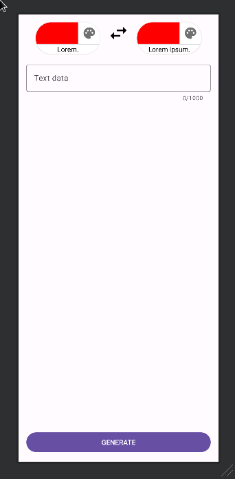
preview
In the preview above, remember the red color on the buttons is a value set for design time and it will not be shown when the app is running:
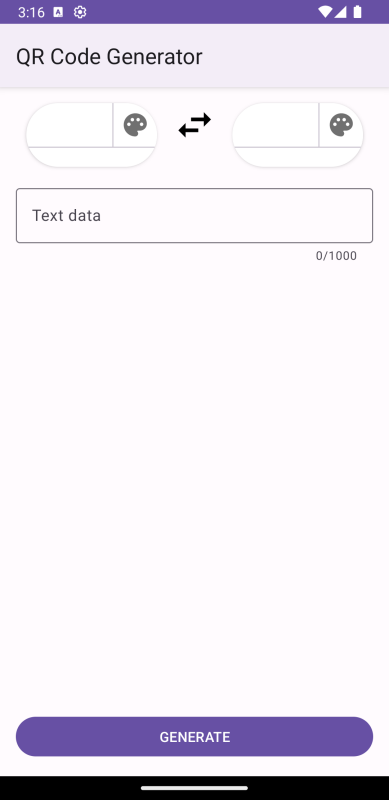
screenshot