Color button design
So far, the buttons for changing foreground and background colors do not have any text or icons to indicate what they do. That is because we are going to create special buttons in place of what we currently have. For the special/custom buttons, we will create a layout in a new file in the res\layout folder. Name the file layout_color_button.xml. Clear the text in the newly created file and type in an empty CardView with the following attributes:
The CardView has an id of container and while the width is set to match the parent container, the height is set to wrap the children we will add inside the CardView soon. Because the layout will be acting as a button, we make sure the CardView will be able to accept clicks/taps by setting both android:focusable and android:clickable to true. Notice that the background is set to ?selectableItemBackground so that there will be a short animation to indicate that the CardView was tapped. A subtle border color is set to a reference to the border_grey color resource. Add the resource by adding the color to the the res/values/colors.xml file:
We will have multiple widgets inside the CardView, but the CardView can only have one child widget. To make what we want work, we will have a ConstraintLayout to be the child of the CardView, and then have multiple widget arranged inside the ConstraintLayout:
The first child widget inside the ConstraintLayout will be a TextView with ID label. The width will be set to match the parent while the height will wrap the text inside it. The text will be center aligned and the text color is set to black. Most important is that the TextView is set to be achored to the bottom of the parent view, the ConstraintLayout:
Next, we will add a horizontal divider:
The divider is set to be above the TextView we just added (with id label.) The next widget will be an icon of to indicate that this layout will be used for something involving color:
An ImageView with id icon is added inside the ConstraintLayout and it will have the image displayed set to a drawable named palette - we will add the drawable soon. The ImageView is set to be vertically anchored between the top of the label TextView and the top of the ConstraintLayout. Horizontally, the ImageView is anchored to the end/right edge of the ConstraintLayout. The size is set to be 44dp x 44dp with a white background. Padding of 8dp is set so that the icon will not be directly againt the edge of the ConstraintLayout.
For the drawable, using the same steps we followed to add the swap drawable, we will look up an icon named “palette” and add it the drawables. Make sure the drawable is named palette because that is the name of the drawable resource that the ImageView expects to be available.
<insert image of palette icon>
Next, we add another divider:
This second divider is vertical and is anchored to the left edge of the icon ImageView between the top edge of the ConstraintLayout and the top edge of the label TextView.
The last child inside the ConstraintLayout will be a View widget that will be named canvas. This widget will have constraints set to have it stretch to fill up the remaining space in the ConstraintLayout:
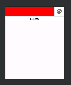
That is all the code that is needed for the layout of our custom buttons. It will look like the image shown below. Note that the red color of the canvas and text of the label are only design time attributes. The proper values for these widgets will be set at runtime.
section 9 image
All of the code for the layout should be like this: