Color picker layout
For picking the foreground or background colors of the QR code, we will use a special layout that will allow a user to choose from a set of preset colors. The user will also be able to pick a custom color by setting the values for the red, green, and blue (RGB) components of the desired color.
Create a new layout resource file named layout_color_picker.xml (in the res/layout folder) and delete the default xml code in that is automatically added by Android Studio, such that the layout file is empty. We will add a different root widget group as the root widget.
The layout will have a vertical LinearLayout as the root widget. The LinearLayout will have a gravity of center, so that regardless of the screen size, the child widgets will be center aligned. The width will match the parent, while the height will be set to wrap the content of the LinearLayout. A padding of 16 dp on all sides will make sure that the child widgets to not run against the edges of the LinearLayout.
The first child widget inside the LinearLayout will be a TextView whose text will be the title/heading of the whole layout. The text will be set as a reference to a string resource named select_color. So add the following to the strings.xml file:
The properties set for the TextView are to make the title standout and make it clear to the user that is able to select a color by interacting with the layout. The TextView’s text is set to be centered, while the width is set to match the parent. Instead of setting a large font/text size, the TextView has a android:textAppearance attribute set to a style named TextAppearance.AppCompat.Headline. You can read more about styles here . To separate the title from the next widget in the bottom margin of 24dp is set:
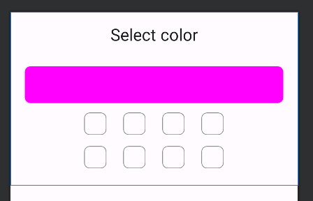
Next in the LinearLayout and below the title TextView, there is a CardView that will show the currently selected color. The ID of the CardView is set to be color_preview. Other attributes like the padding, a height of 64dp and the rounded corners of 8dp have been set to make it look nice.
Still inside the root LinearLayout, we will add a ChipGroup to hold Chip widgets that will be used to set one of the preset colors as a selection. The ChipGroup is set to with an ID of chip_group_1 because there will be second ChipGroup. Each of the ChipGroups will act be a row of Chip widgets with app:selectionRequired set to false and app:singleSelection set to true. This means a selection for each ChipGroup will be optional (since the user might decided to set a custom color), but when one of the Chip widgets is selected, only one can be selected at a time.
After the first ChipGroup, we will add the second one inside the LinearLayout, so that we have two rows of Chip widgets in the layout:
Take note of the IDs that have been set for each of the 2 ChipGroups and all 8 Chip widgets. The IDs will later be used to refer to these widgets later in code. At this point, your layout in design view should look something like this:
7 image
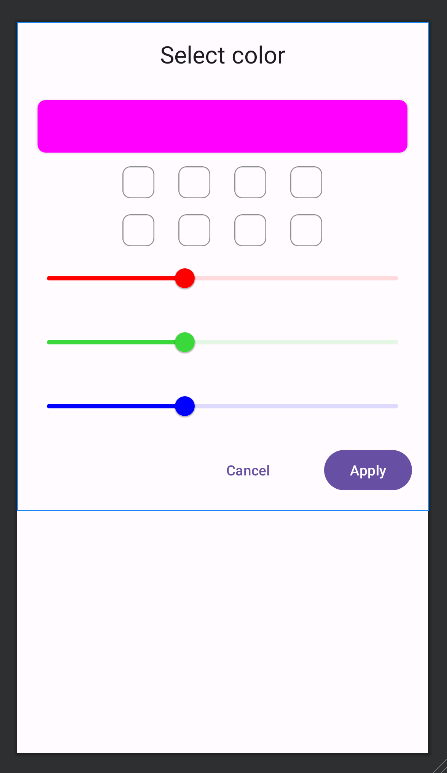
The general idea is that when one of the Chip widgets is selected, the preset color the Chip represents will be set as the background color of the color_preview CardView. Below the ChipGroup widgets, we will have 3 Slider widgets that will be used to set a custom color:
The Slider widgets will represent the red, green, and blue components of the color the user desires to select. You can learn more about the RGB color model here . The important attributes to note are the android:valueFrom, android:valueTo, and android:stepSize. These are set such that each Slider can have a value between 0 and 255 inclusive. Also take note of the values set for the android:id as these will be useful later for referring to each Slider widget. The rest of the attributes have been set to make each Slider look nice and indicate the color it represents. This means we do not need to set text labels to show what color component each Slider represents.
Finally, the last child of the root LinearLayout will be a child LinearLayout that will hold 2 buttons: a Cancel and Apply button:
This whole layout will be presented as a dialog window. When the Cancel button is tapped, the dialog window will be dismissed, ignoring the color selection - if one had been made. On the other hand, if the Apply button is tapped, the value of the selected color is passed back to the code that requested the color selection dialog window and then the dialog window is dismissed. Note the different that visual styles that have been set for each button such that the user's visual attention is drawn to the Apply button. The buttons use string references for the android:text values. The Cancel button uses the built-in string reference of @android:string/cancel while the Apply button uses a custom string reference of @string/apply. Add the following to your strings.xml file:
That is all for the layout of the color selection dialog window. If you have entered all the xml code correctly, your layout in design view should look like this:
11 image
The complete code for the layout_color_picker.xml file must be as follows: